Corporate Identity
Through consistent use, most any logo can become a vivid shorthand. The priority is to find an expressive device, an idea — preferably product-related — that reinforces the company name. Although this is often conceptual, a logotype distinguished in this manner works harder, has greater visual impact and is easier to remember. It possesses the promise of meaning and the pleasure of recognition.
A sample of our logo designs and their implementations are featured at left with their previous versions shown below.
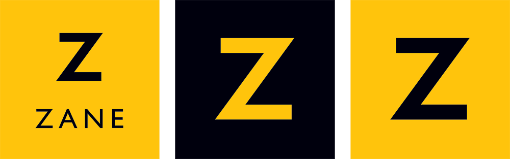
Zane MacGregor
![]()
Zane MacGregor is a sophisticated real estate brokerage in Palo Alto, California. They contacted us with aspirations to update their image, which was showing its age. The previous logo was designed to communicate professionalism, akin to a law firm, and positioned them effectively versus early competition. Since, however, real estate has exploded on the Peninsula and, although Zane has been extremely successful, their image no longer represented leadership nor innovation … two characteristics highly valued by Peninsula home buyers. Our charge was to maintain the professional tone while injecting authentic elements of energy, originality, and humanity. Using a classic san serif font, we designed a clean, welcoming logotype that extended the poise of the original, while also projecting the strength and confidence it lacked. We also recommended dropping MacGregor from the firm name as it was no longer relevant and difficult to spell correctly when searching.
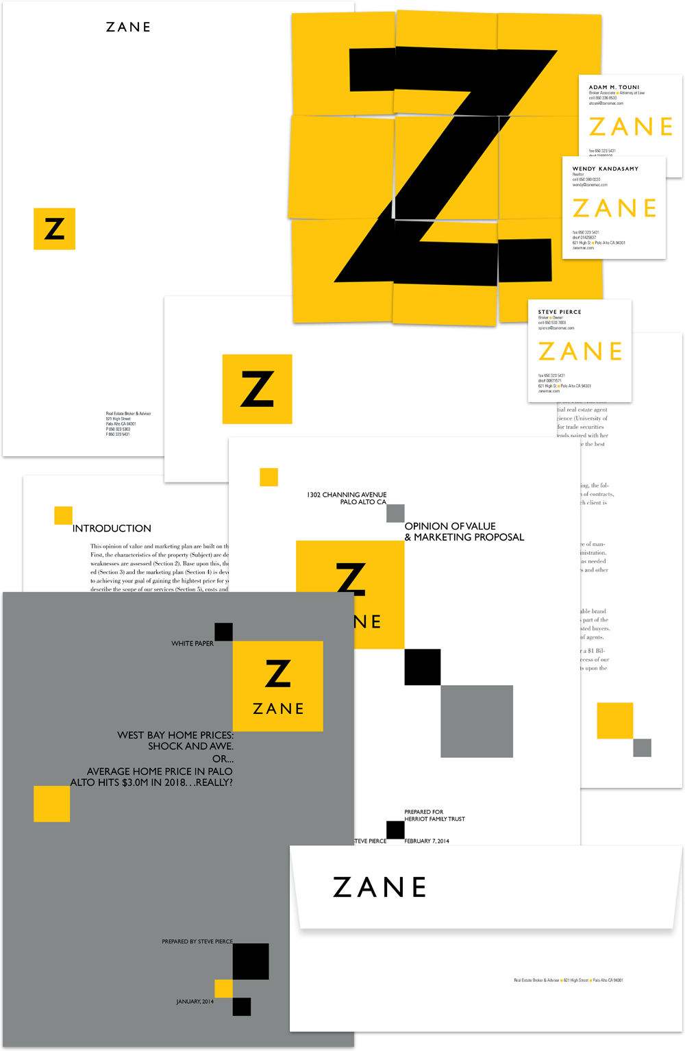
Fisk Alloy
![]()
![]()
Fisk Alloy engineers wire for the automotive, medical, aerospace, defense and electronics industries. Founded in 1973, their old brand identity didn’t project the global leadership position Fisk owns today. The new logo, thus, had to achieve several objectives. As a comprehensive expression, a new identity had to accurately reflect the personality of multiple company divisions. It also needed to bring Fisk into the new century and beyond, and speak to the company’s global presence (hence the use of European formats for company literature and business papers). Finally, it had to reconcile the sometimes conflicting ideas of stability & reliability against invention & creativity. Thus, the juxtaposition of thin, rigid wire elements against clean backgrounds, and photography that turns an industrial factory, gritty machinery and wire into art.
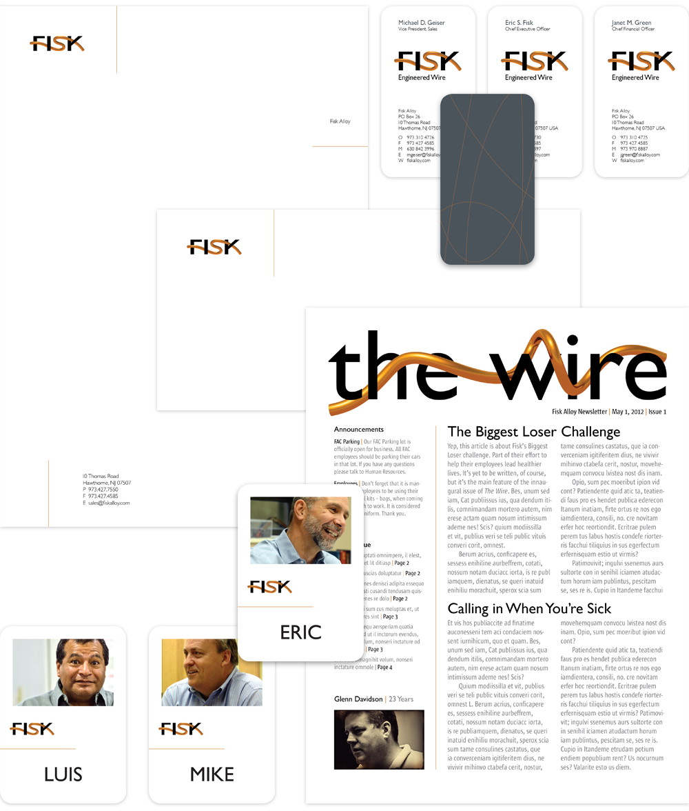
Senturus
![]()
For years businesses have been expanding further into the digital universe, collecting massive quantities of data along the way. Making sense of it has become the challenge. Senturus is a business intelligence company, helping clients unravel the immense value that is locked in their data and putting it to work for business gain. Essentially, creating clarity from chaos. One Degree redesigned the Senturus brand identity with this mantra in mind, and did a ground-up development and production of their transactional website as well.
Maze
![]()

We designed a lyrical marque to unify previously disparate units that share a common goal — rewarding human interactions. The intertwining, ribbon-like forms evoke the image of an embracing couple or parent and child, and are not unlike a DNA strand, underscoring the scientific foundation of their care. Color provides other visual cues, and is used to represent the breadth of specialties within the practice.
AODocs
![]()
AODocs is an innovative document management platform for Google Apps. They needed a new logo that quickly communicated their integration with the search giant, while also cutting through the cacophony of google-ness in the Google Apps Marketplace. They also hoped it would project their core value proposition quickly and offer a framework for several enterprise-grade products as they expanded globally.
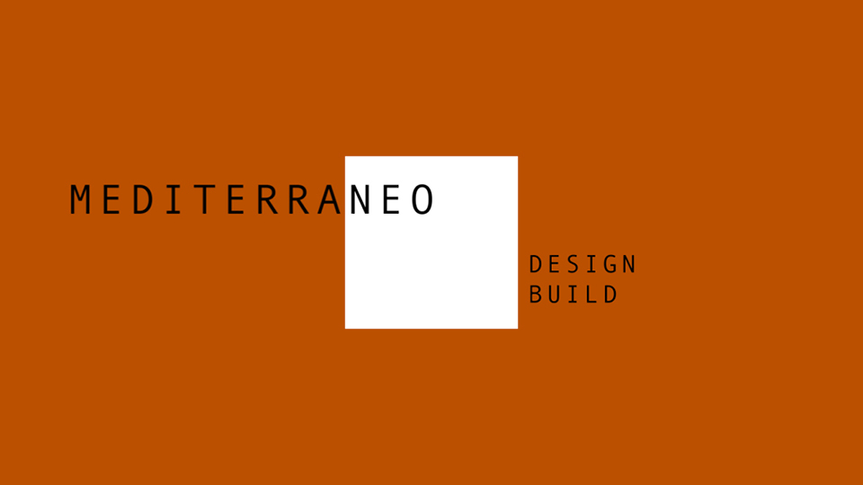
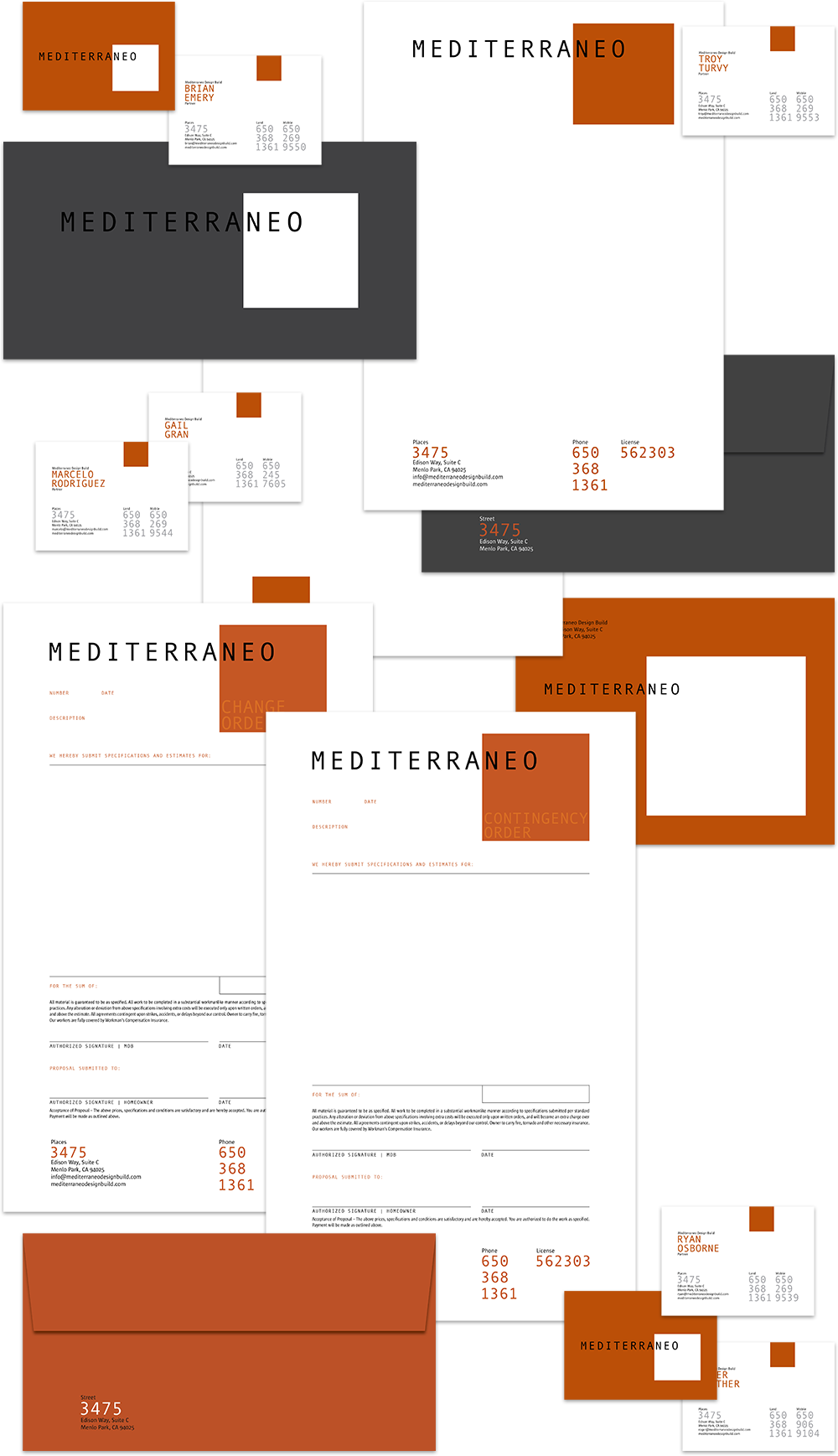
Mediterraneo
![]()
Mediterraneo’s partners felt their name pigeon-holed them as builders specializing in Mediterranean-style home design and construction, thus wanted to abandon it. But twenty years of equity is a lot to sacrifice, so we redesigned the logo instead. We married “Mediterraneo” with a square field to emphasize the last three letters neo, and lend a subtle message, “new space.” We developed a color palette dominated by terracotta and cement — two prominent colors in California construction, and shot gritty photography depicting their crews hard at work, and architectural-style imagery of their projects.